Sunday, 22 January 2012

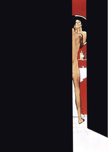
The Men of Rene Gruau


Just over a year ago I was asked to be a part of the exhibition 'Dior Illustrated: Rene Gruau and the Line of Beauty' at Somerset House in London. Being predominantly a menswear illustrator, I was chosen to respond to Gruau's male depictions, and produce an original piece. Although I'd seen his work before, I had never thought to study it at length, and researching more now, I realise just how many illustrations Gruau produced. It easily goes into the four figures area. There are so many out there that it boggles the mind, nearly all with his recognisable style and line play. I thought with this post it would be great to focus on his mens illustrations alone, knowing that they are often neglected when it comes to focusing on his more iconic works.

With the mens illustrations in particular, it's noticeable how Gruau changed his line tactics in portraying men. He often reduced women down to a few simple lines, creating fluid, elegant, stylish and suggestive works that were more creative and expressive than diagrammatic or representational. With his men, he focused on the ability to use negative space, stronger lines and bolder colours to channel a masculine identity. The fact that Gruau was able to confidently convey male and female sensuality through such subtle differences in technique is astounding.

Easily the most popular of all where the Dior Sauvage ads, which where often composed as scenes using just a few main components. Bold black, bold red, a fully realised male figure - mostly nude or in a towel, and postures and facial expressions that gave the man his character, which was usually laid back, collected and debonair.
This style of gentleman followed throughout most of his work, an identifiably cool customer, always relaxed. There was a great sense of humour and ease to the works which gave them a great sex appeal, the hairy legs of a Sauvage man in a bathrobe, the man struggling to hold up a colossal bouquet of roses.
Rare examples of other looks Gruau tried in his men included the long & untamed hair men in two Dior Sauvage ads that I cannot seem to find anywhere, save for two tiny thumbnails on the official Rene Gruau Site. (These admittedly aren't as effective as his other depictions and have been less favoured by most).
Also his Dormeuil men of the 80s are significantly stronger in their appearance, due in part to the times of the 80s powersuit and also for brand image. There's also one rare pencil drawing (currently available at Christie's auction house) which I haven't come across before.

Rene also produced 48 original cover illustrations for Sir Magazine, all of which can be seen HERE. Amazing gallery, so rather than repost them all here, make sure you take a look, his variation and simplicity continue to be of great inspiration to any illustrator. It's a great shame the official website for Rene Gruau is rather gross and unnappealing. His work is so protected that it offers not much more than tiny thumbnails to view, all cocooned in a poor website design.

Another website which is brilliant for seeing hundreds, literally, at least 500 more of Gruau's work is www.hprints.com, just search 'rene gruau'. There are nearly a hundred illustrations in this post so be warned of long loading times / scrolling.


for Christian Dior:


Dior: Jules fragrance


Unpublished illustrations for Jules, 1980.


Dior: Eau Sauvage:


Continue Reading . . .

Sunday, 8 January 2012

Mats Gustafson


There's not much that needs to be said about Mats work. It's so beautifully simple that discussing and dissecting his style feels completely unneccessary. Always graceful, graphic, timeless and stylish, his work transcends eras and defies becoming attached to a particular time period or decade. I've compiled as much as I can but the body of work is simply too exhaustive.
Mats has amassed a great amount of work in his signature stripped down aesthetic. Some nice diversions I managed to come across include different materials used and three mens illustrations. Mats draws from the best designers and for the best magazines, and that is how it should be for the best illustrators.

Make sure you look at the website for The Fashion Illustration Gallery. All the photographed spread images from the Vogue Italias that you see further down are from their site. There are even more gorgeous spreads to see over there and all the original magazines are available to purchase.

There's also his large portfolios over at Art _+ Commerce, his agency's site. There's plenty more work that isn't in this post, including stronger silhouettes and poses, although rather annoyingly, all the images are watermarked with the the Art + Commerce logo, but it's still worth looking. Enjoy!.


Continue Reading . . .

Monday, 19 December 2011

Decoy Issue 3 out now!!


The third issue of my fanzine Decoy is now available, and as you can see has made the jump from black and white to colour. I've reimagined my favourite male model Will Eustace in Dior Homme and Versace H&M for the cover.

Richard Gray's phenomenal exclusive illustration is the A2 centrefold for this issue, with an accompanying interview. It also has a fantastic full page exclusive by Jean Paul Thurlow, and interviews with Alex Noble, Akmal Shaukat and Sabine Pieper.

Above are two of my own illustrations for the issue, (I posted a different one a few weeks back) and the Richard Gray exclusive. To look at more info head over to my website!

Thursday, 15 December 2011

Here It Is!


The new issue! (click to enlarge)

It's finally gone to print and will be available from tuesday 20th december at the latest. I couldn't resist drawing my favourite model again, Will Eustace, who is becoming something of a muse to me, this time wearing Dior Homme SS12 and Versace x HM.

Decoy has made the jump to full traditional colour newsprint with this issue and with a slightly increased page count too, I'm very proud of this one!

The issue contains:

four new illustrations by myself, a COLOSSAL A2 exclusive centrefold by Richard Gray, with accompanying interview, an exclusive illustration for Decoy by Jean Paul Thurlow, and interviews with Alex Noble, Sabine Pieper and Akmal Shaukat, all with illustrations.

To be notified the moment it becomes available, email richard@richardkilroy.com
Head over to Trendland to see the exclusive preview!

Thursday, 8 December 2011

Thierry Perez


I made this post a while back but had to delete it because of a Virus scare. Thankfully, I still have all the images, and now a few new ones! It's super hard to find Thierry's work online. The book 'Fashion Illustration' by Nicholas Drake has always been the key source (and is wildly cheap on amazon now) but apart from that, I'm stumped. He was clearly drawn to super fierce women of the 90s, most notably, all the supermodels and Madonna, who he continuously drew, and as I saw in the book 'Madonna in Art' continues to draw Madonna in each new incarnation of her image. He worked exclusively for Gaultier until 1991 which shows in all the outfit illustrations for Madonna's Blonde Ambition Tour.

However, he will always be known for the fashion illustrations featured below. One interesting clip of an Alaia show shows a rare animated illustration feature worked into a clip of Alaia's spring 1991 show, including Neneh Cherry.


More after the jump . . .

Saturday, 3 December 2011

George Stavrinos in Colour.


The above two are apparently for a German company that manufactured fabric.


'Rustler' for Blueboy Magazine.


'Racquetball'


Unknown.


Anyone who owns issue 2 of Decoy or have visited this or my own blog, I've been a big fan of George Stavrinos for a few years. Since Sue Tait Porcaro launched the Facebook group 'Fans of George Stavrinos' many more of his hard to find illustrations have been uploaded onto the page.

Given that George was primarily known for his black and white drawings, I thought it would be interesting to compile a post of all his colour work. There is a lot of work for the gay porn magazine Blueboy that appears to exist NOWHERE online, and the best I can offer here is what I have managed to source either myself or via the works that have been uploaded to the facebook page via other group members, including members Herb Greenwood and Robert De Michiell which I am infinitely grateful for.

While the illustrations here bare all the hallmarks of George's technique, it's the black and white work for Barneys and Bergdorf that really did set him apart. I guess with these being in colour, they become endowed with reality too much, and the black and white work allowed Stavrinos to play about with line and stylization more, playing on his accentuation of edges and strong angular shapes. Admittedly, I still prefer his monochomatic work, but these goes to show that George was no stranger to colour and in fact used it very effectively. I'm still desperate to see these illustrations in their full glory. Some of the drawings, particularly the one directly below, are studies for other illustrations and not final pieces.


'Study for Bather'


Unknown. Guessing for Blueboy magazine?


More after the jump . . .