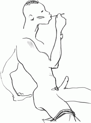
Eduard studied painting, sculpture and theater design in Moscow, Russia, and illustration in New York where he now lives. For anyone who hasn't seen his work at all before, it could almost be forgiven than some of his simpler silhouettes could be mistaken for the style of Mats Gustafson. However, there are many differences in these alone, and to compare an illustrators style so much without pointing out the differences would be unforgivable.
Maybe it's because I'm an illustrator myself that I actually prefer looking at his simple line works, the power in just a few simple strokes is an effect that most illustrators dream of achieving.
His women are powerful with their presence and their stature, demure attitude and long limbs but his studio men are powerful sexual beings, often erect, with strong brows, muscles and contorted in sexually alluring stances. Tattoos, cigarettes and hoop earrings are regular accessories. And I love them.
Again, with my love of illustrators such as Rene Gruau, David Downton and Bernadette Pascua, there's that use of basic line. It's something that is taught to anyone who has ever even been to a life-drawing class, or any higher education art class at all, that the power of the line and it's ability to describe with such little information is not to be forgotten. I feel like it's a point I drum out in nearly every blog post to the point of lunacy / tiresomeness, and regular readers are probably bored of me pointing out the obvious. But for anyone looking at his studio series, it will immediately bring back memories of being taught this.
Vivid deep colours play a particurlarly strong role, you'd be hard pushed to find any pastille tones here. It works in total sync with the confident individuals he is portraying. Bold, enigmatic and bursting out of the page. A great aspect of his work is the use of basic background elements to conjure up a scene. With adding just one or two elements, perhaps a cocktail glass, a boat silhouette, a curtain outline or the silhouette of a certain style of elegant sofa, he is able to create these illusions of glamour that describe a scene without ever actually really showing it, letting the clothes take dominance of the composition.
more information:
Mr Erlikh is internationally renowned for creating editorials for publications including:
Vogue USA, Vogue Germany, Vogue Japan, Vogue Sposa Italy, Bazaar Japan,Marie Clair France, Elle Germany, Madame Figaro Paris, W, Wallpaper, FrauJapan, Town&Country, NK Stil, Domino, and Tush.
Commercial clients include: Tiffany&Co, The Limited, Ann Taylor,Bloomingdales, Talbots, Holt Renfrew, 9 West, Coach, Van Cleef and Arpel, Royalton, Clinique, Cinzano.
Continue Reading . . .
this one in particular I love. The line treatment for the feathers and fur in such a simple way is just heavenly.


No comments:
Post a Comment