Friday 24 February 2012

New Exhibition - The Gruau Man


Having just recently posted an extra large post on all of Rene Gruau's mens illustrations here, I'm absolutely delighted to see that The Fashion Illustration Gallery in association with Paul Smith will be launching a new exhibition on the 21st March, The Gruau Man.

I will most DEFINITELY be attending, any chance to see Gruau's work up close is always one that shouldn't be missed. The exhibition will focus largely on his work with Sir Magazine, which you can see more of the covers for here.

More details from the press release:

RENÉ GRUAU ( 1 9 0 9 - 2 0 0 4 )
THE GRUAU MAN
WEDNESDAY MARCH 21ST - SATURDAY APRIL 21ST 2011
PAUL SMITH, No.9 ALBEMARLE STREET, LONDON W1S 4BL

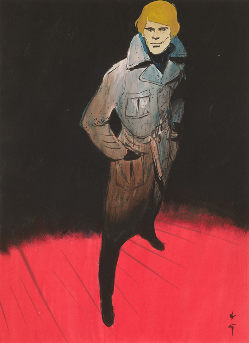
Fashion Illustration Gallery in association with Paul Smith No.9 Albemarle Street is delighted to present The Gruau Man an exhibition of works on paper made by René Gruau featuring only men.

The works exhibited span a 16 year period from 1956 to 1972. They were prepared for the front covers of the magazine Sir: Men’s International Fashion Journal. Published quarterly in Amsterdam by Ludwig Katz, Sir was the baby brother publication of
International Textiles magazine whose Gruau covers FIG exhibited at The Mayor Gallery at the end of 2010.

On the surface, crafted in gouache and felt tip pen, Gruau’s man is chiselled, groomed, suave and sophisticated. Suited and booted he is always dapper, sometimes depicted with a strategically dipped Trilby hat and occasionally accessorized with an umbrella or cigarette. He’s the picture of simmering machismo. He’s the man about town, a real life James Bond in control of every situation he finds himself in.
Beneath the surface and the primary colours Gruau’s man, for all his brooding self assuredness makes Lichtenstein’s Brad look positively three dimensional. When he appears with a suitcase you can’t be sure that he’s really going anywhere and the longer he strikes a pose and stares out of his frame the more one realises his eyes are connecting only with his own. He’s looking in the mirror and we repeatedly catch him doing so.

Gruau’s man is to Gruau’s woman what Ken is to Barbie or Leandro Penna is to Katie Price. He’s a piece of arm candy an accessory to fashion. He’s Gruau’s fantasy Action Man.

These works have rarely been shown. In 1972, Sir works were exhibited in Holland and a small group were recently showcased in London. Works for the covers of two issues of Sir, dated 1957 and 1962, are featured in a recent monograph on Gruau, and
another appears in Cally Blackman’s 100 Years of Fashion Illustration.

Sunday 5 February 2012

Miss Piggy makes the cover of Sunday Times Style magazine


Fashion icon Miss Piggy plays the editor of French Vogue in the new Muppets movie, and to promote the film, she's featured on the cover of Sunday Style, in an editorial wearing exclusively made Jason Wu, Prabal Gurung, Brian Atwood, Opening Ceremony, Giles & Brother and Philip Crangi, and offering hilarious advice and fashion tips. Make sure you click to enlarge and read. Riding the wave of success, she has also created a range of makeup for Mac.
This isn't the first time Piggy has featured in a high fashion shoot, several years ago she featured in three shoots for Katie Grand's Pop magazine, wearing custom made Prada, Louis Vuitton, Miu Miu, Burberry Prorsum and Bvlgari jewellery.


'American Pigolo' shoot for Pop:


Continue Reading . . .

Thursday 2 February 2012

The Fashion Illustrations and Working Sketches of Jean Paul Goude.

Image and video hosting by TinyPic
Drugstore Fop, 1966.


Jean Paul Goude's current retrospective 'Goudemalion' at Les Arts Décoratifs in Paris has resulted in the release of a new book to coincide with the exhibition, simply titled 'Jean Paul Goude'. I was hesitant to see just how much new work would be in the book, given that I already own So Far So Goude (2005) and The Goude Touch (2009), both fantastic titles showing just as many working sketches as they do final works and photography. It's incredibly surprising then just how much new work and previously unseen sketches have made it into the new book. Unable to attend the exhibition, this new volume, with over FIVE HUNDRED images, will ease the pain of not being able to see most of it in person.

The beauty of Goude's work lies in its humour and delightful daftness as much as it does his strong visual language, and the ability to combine both effortlessly. Thanks to his past work as an illustrator / artist / painter / graphic designer, his working sketches have become an integral part of his portfolio and have surpassed the idea of more than just a working doodle. All of his books contain large amounts of them and are just as joyful and inspirational as his photography.

Within the visual language of his idea sketches are strong lines, blocks, cut ups, altered borders and heavy edges. What separates his style from others is that he doesn't just consider these an illustrative element or just part of his drawing style. He completely lifts them as inspiration, and uses them straight into his photography. Basically, his drawing technique informs his photography style, as opposed to just sketching out an idea, then photographing it.


indian ink on tracing paper, 1969.


(So Far So Goude dates this as 1969, whereas Jean Paul Goude dates it as 1966.)


detail of wall fresco for Printemps, 1966.


All for Printemps, 1964.


Jean Paul considers his early fashion illustration work for Printemps to be the beginning of his suited style, which suited both his 'morphology and dreams of rising up socially'. He used his friends as models after being asked to fill the empty walls of Printemps' mens store, Brummel.
"They were all there: Maurice, Albert, and Jean-Jacques, all very chic, brought together in a giant fresco that ran the whole length of the store. In my narcissistic quest for personal elegance, I had become, without being quite aware of it, a kind of reference for the 'drugstore fops,' the real ones, those from Passy."

My favourite in particular is the figure slouched in the chair, one accentuated square shoulder and fading legs, finished with the shoe outline. It's beautifully expressive and just slightly abstract in its finish. This out of all them is the best indicator of where Goude's style would go.

An interesting excerpt from the new book:
"As a child I was fascinated by René Gruau's drawings that were pasted up all over Paris. . . After an extremely promising start, my career as a fashion illustrator finished in bitter failure. It all started when the artistic director of the printemps department store, Kimpy Baumgartner, suggested I cover the walls of the store with my drawings. They were brush and ink drawings, quite spirited, showing my little gang from Saint Mandé with the new look I lavished on them. So not a great thing to do for a commission. I'd forgotten that my role was to make a case for what the client was supposed to be selling. The fashion of the time that I'd been asked to interpret for the store was the complete opposite of what I considered stylish - it just couldn't work. After a year the freshness of my first drawings had evaporated, and i was totally out of favour. I was barely 24 years old."


for Esquire, pencil, 1976.

Continue Reading . . .

Wednesday 1 February 2012

Tony Viramontes illustrates Claude Montana


If you're a fan of Viramontes, then make sure you join the facebook fan page, which continually updates with new unseen archive illustrations and exclusive information regarding the new upcoming book on his work.

Here are three studies that were posted recently which I felt compelled to share. They reflect perfectly Viramontes' energetic style while avoiding colour and materials that usually associate him with the 80s / 90s time period he is so reflective of. Claude Montana himself confirmed that these were indeed studies of his works.