
Just over a year ago I was asked to be a part of the exhibition 'Dior Illustrated: Rene Gruau and the Line of Beauty' at Somerset House in London. Being predominantly a menswear illustrator, I was chosen to respond to Gruau's male depictions, and produce an original piece. Although I'd seen his work before, I had never thought to study it at length, and researching more now, I realise just how many illustrations Gruau produced. It easily goes into the four figures area. There are so many out there that it boggles the mind, nearly all with his recognisable style and line play. I thought with this post it would be great to focus on his mens illustrations alone, knowing that they are often neglected when it comes to focusing on his more iconic works.
With the mens illustrations in particular, it's noticeable how Gruau changed his line tactics in portraying men. He often reduced women down to a few simple lines, creating fluid, elegant, stylish and suggestive works that were more creative and expressive than diagrammatic or representational. With his men, he focused on the ability to use negative space, stronger lines and bolder colours to channel a masculine identity. The fact that Gruau was able to confidently convey male and female sensuality through such subtle differences in technique is astounding.
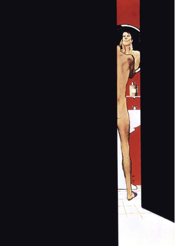
Easily the most popular of all where the Dior Sauvage ads, which where often composed as scenes using just a few main components. Bold black, bold red, a fully realised male figure - mostly nude or in a towel, and postures and facial expressions that gave the man his character, which was usually laid back, collected and debonair.
This style of gentleman followed throughout most of his work, an identifiably cool customer, always relaxed. There was a great sense of humour and ease to the works which gave them a great sex appeal, the hairy legs of a Sauvage man in a bathrobe, the man struggling to hold up a colossal bouquet of roses.
Rare examples of other looks Gruau tried in his men included the long & untamed hair men in two Dior Sauvage ads that I cannot seem to find anywhere, save for two tiny thumbnails on the official Rene Gruau Site. (These admittedly aren't as effective as his other depictions and have been less favoured by most).
Also his Dormeuil men of the 80s are significantly stronger in their appearance, due in part to the times of the 80s powersuit and also for brand image. There's also one rare pencil drawing (currently available at Christie's auction house) which I haven't come across before.
Rene also produced 48 original cover illustrations for Sir Magazine, all of which can be seen HERE. Amazing gallery, so rather than repost them all here, make sure you take a look, his variation and simplicity continue to be of great inspiration to any illustrator. It's a great shame the official website for Rene Gruau is rather gross and unnappealing. His work is so protected that it offers not much more than tiny thumbnails to view, all cocooned in a poor website design.
Another website which is brilliant for seeing hundreds, literally, at least 500 more of Gruau's work is www.hprints.com, just search 'rene gruau'. There are nearly a hundred illustrations in this post so be warned of long loading times / scrolling.
for Christian Dior:


Dior: Jules fragrance


Unpublished illustrations for Jules, 1980.


Dior: Eau Sauvage:


Continue Reading . . .


