Tuesday, 18 September 2018

Robson Stannard


Robson Stannard utilizes a style heavily dependent on a joyous mix of colour combinations and sweeping paint gestures, churning colours into vivid forms. Runner up in CassArt's Draw Fashion competition last year, his unique and simplistic approach has seen him recently included in SHOWstudio's growing list of illustrators to interpret Fashion Week. 

The clothing element is perhaps obviously secondary but not unlike most fashion illustrators and artists, his choice and selection of clothing or muse act simply to further an identity creation that complements his own aesthetic, rather than merely recording somebody else.


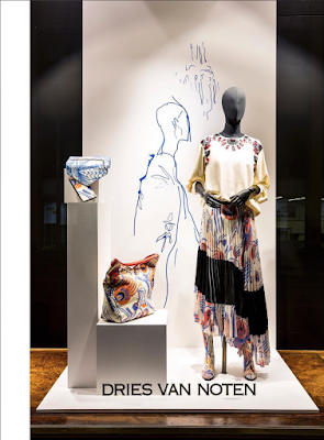
Richard Haines x Dries Van Noten


Above: The Dries Van Noted store, Antwerp.


Dries Van Noten has once again collaborated with the brilliant Richard Haines for a new series of illustrations inspired on the ballpoint drawn prints from the AW 2018-19 Women’s collection. Using only the ubiquitous biro pen himself, Haines lends his whimsical line style to these wonderful promotional drawings.

"Backstage, Van Noten said his studio had been perfecting the elaborate biro-like prints that defined the collection for three months. They had a doodling quality to them, which, up close, felt much more spontaneous and exuberant than it looked from afar. The inspiration was Art Brut – outsider art – named so because it’s executed by amateur artists with no gallery contracts or responsibilities to speak of. “Postmen in the South of France,” as Van Noten quipped."
www.vogue.com


Wednesday, 14 June 2017

Elizabeth Peyton, Another Man SS17

Exclusive artwork by Elizabeth Peyton, accompanying photographs of Elias Bender Rønnenfelt for Another Man's latest issue.


Monday, 12 June 2017

Frida Wannaberger

The charming solemnity of Frida Wannaberger's drawings continues to garner attention and praise. Reflected in recent commissions for SHOWstudio and Pringle of Scotland, Wannaberger's figures are identifiable for their aloof stance and beautifully awkward expression, their faces seemingly expressionless and yet pained, questioning or curious through the shape of their eyes and eyebrows, muted calm colors and background tones befitting of this mood. Usually working to an A4 or A3 size, viewing the work in person invites closer examination to appreciate the super fine delicacy and linework used to create this.

Recommended: Fashion Flora exhibit at SHOWstudio featuring Frida closes 22nd July, more info here.

Dries Van Noten Spring Summer 1993, for SHOWstudio


Below, Frida Wannaberger for Pringle of Scotland SS17. Text from Pringle of Scotland website.

Pringle of Scotland has long admired the work of illustrator Frida Wannerberger. We first invited her to our Spring/Summer ’17 show to illustrate the collection’s key looks, and we were delighted to have her back for Autumn/Winter ’17 to illustrate three women’s and three men’s looks in her own unique style.
Frida has always had an intense love for fashion. She trained at Central Saint Martins and after graduating produced merchandise imagery for the IsabellaBlow: FashionGalore! exhibition at Somerset House. She was also invited as fashion week illustrator-in-residence at Nick Knight’s SHOWstudio. On top of all her project work Frida is a visiting lecturer on the BA Fashion Illustration Course at London College of Fashion.


Tuesday, 11 October 2016

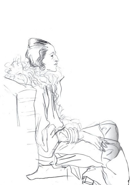
Diana Vreeland, the Illustrator's Muse


Mel Odom, Portrait of Ms Vreeland, 1980s.


With the possible exception of Anna Piaggi, the appearance of no other fashion editor or matriarch in fashion has had quite the influence on illustrators and artists like the figure of Diana Vreeland. Former editor in chief of American Vogue, Ms Vreeland's symbolic profile, one that can be reduced to just a nose bump and cigarette holder is one so recognizable and so emblematic of an era that many continue to be inspired to transcribe her image to this day. 
The results shown here by a significant roster of artists from past and present interestingly all portray Vreeland's iconic appearance consisting of black clothing, pale skin and red make-up, proving Vreeland's self-constructed image has equally immortalized itself alongside her leadership.

Mel Odom on the story behind his portrait:

"It was done in the 1980s as a thank you to Ms Vreeland for the giant signature she wrote in my copy of Allure. I did it overnight and ran it to her building the next day after I got the book. I did it so fast that years later when it was auctioned off with her other things I had forgotten even having done it. When the one-woman show about Ms Vreeland, "Full Gallop" was running in NYC I went to see it with friends. My drawing (actually a copy) was framed and hanging on the set of her apartment. I spoke with the stage manager who let me go on stage after the show for a closer look. He told me that if it was hanging on the set it had also been hanging in her home the same way, as the set was a precise copy of the real thing. I was thrilled!" Mel Odom


David Downton, Personal Work, 2013

"I think she appeals to artists so much because she was self-invented. Larger than life. In a sense she had already done the drawing. I would have loved to have met her..." David Downton


Richard Haines for What I Saw Today, 2011.


Richard Haines for What I Saw Today, June 2011.


Zoe Taylor, Too Much Night, Syntax Editions 3, 2010.


Diana Vreeland looks at a drawing with Cecil Beaton, 1965.


Jean Paul Goude, Lady Diana Vreeland, 2015.


Kenneth Paul Block, 1967.


Kenneth Paul Block, year unknown.


Mats Gustafson, 1982.
Antonio Lopez, year unknown.


Joe Eula, year unknown.


Richard Bernstein, Interview Magazine, December 1980.


Richard Ely, 1989.


Cecil Beaton, 1954.


Cecil Beaton
Diana Vreeland, The Modern Woman; The Bazaar Years 1936-1963. Rizzoli Publishing, 2015. 


René Bouché, Date Unknown


(t/y Mel Odom, David Downton)


Tuesday, 27 September 2016

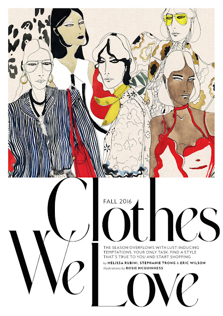
Rosie McGuinness

The fluidity and form of Rosie McGuinness's oeuvre of work is one that marries both the approach to classical fashion drawing, conjuring the lines of illustrators like Rene Bouche and Kenneth Paul Block to a far more contemporary vision of style, channelled through her selective poses and muse of woman.

Emitting a sense of serenity; Rosie's women are narrow and elegantly dressed in a way that imply a lifestyle surrounded by good taste. Her figures usually appears to have a paired back appearance with often centre parted hair and features not dissimilar from figures in the industry like Jamie Bochert and Phoebe Philo. Her selection of muted paper tones and languid instant brush marks serve to build this timeless visual.

 "Illustration for me is a hugely satisfying creative process, something to concentrate on with instant results.
Drawing by hand, the quality and strength of line is important to me – as is an overall balance to the page – posture and pose need to be correct and grounded, which can take a number of drafts. I have tried tracing over images to alter or correct a line or angle – but I almost always find that the initial free drawn line or mark is best, the most expressive, and that this quality can not be falsified or recreated exactly."

- excerpt from a 2012 interview with slashstrokemagazine.com

Images from Instagram and rosiemcguinness.com